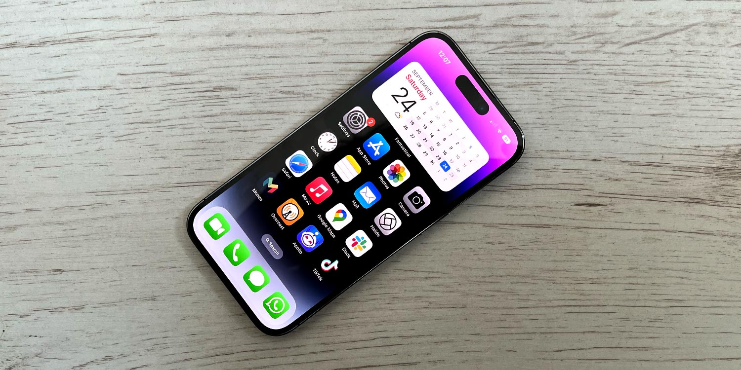
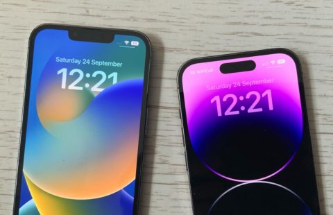
Dynamic Island is Apple’s name for the ‘hole’ at the top of the display on the latest iPhones. It’s the successor to the ‘notch’ cut-out that came before it, and is found on the iPhone 14 Pro, iPhone 15, and iPhone 15 Pro.
Despite its slightly pretentious name, this is classic Apple design, bringing hardware and software together to create something playful and unique. The pill-shaped cut-out still hides the same front camera and Face ID sensors the notch did, but the area now does double duty as an useful part of the interface. It’s no longer just a static void.
Mover and shaker
Dynamic Island breathes life into the status bar, using the space up top to show useful information and alerts at a glance. It can widen to show more data, expand to cover more of the screen when needed, shrink back when you’re done, and even bubble out a second island to display two types of info at once.
The animations are smooth and the deep black of the OLED display blends the island seamlessly into the physical cut-out so it appears as a single shape. You’ll feel subtle haptic feedback when pressing the island as it reacts to your touch. Like we said, hardware and software working together.
Info at a glance
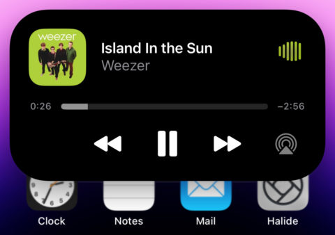
Generally, the island shows background activities. If you’re playing music, or running a timer, or waiting for a ride, you’ll see details up there. Long-press to expand the island and access more detail. You get playback controls for music, pause/cancel buttons for timers, and so on. If you need more, instead give the island a tap to open the relevant app in full.
It also gives a little animation to confirm various interactions, like unlocking your device or connecting headphones. When you’re taking a call, you’ll get the phone controls within easy reach. It’s a smart way to fit extra info into an otherwise wasted part of the display.


