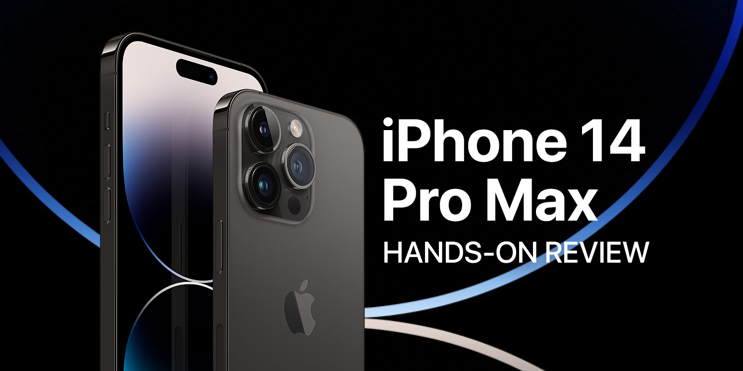
We dig into whether you should max out on a flagship Apple phone or stick with another model
Apple plays fast and loose with the word ‘pro’, but products branded this way do have meaningful differentiation from their ‘standard’ equivalents. With 2022’s new iPhones, this is more stark than ever. Not since the iPhone X has there been more space between regular iPhones (back then, the 8 and 8 Plus) and whatever’s at the top of the line.
We spent two weeks with the iPhone 14 Pro Max, to find out what’s new, what the Pro models offer over the base iPhone, whether they’re worth the extra outlay, and if you should splash out even more money to go Pro Max. Here’s what we found:
Snap happy: Camera comparisons
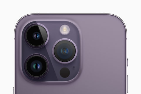
Flip over an iPhone 14 and an iPhone 14 Pro/Pro Max and you see immediate differences. The Pros have an extra camera (which since the 11 has been a telephoto lens). Start using the phones and you quickly realize the gap is even bigger.
While the iPhone 14 sticks with a 12MP main camera, the Pro gets a new 48MP quad-pixel sensor. Combined with fancy Apple tech, this makes for more detailed images and higher-quality snaps in low light. It also lets you shoot gargantuan 8064×6048 ProRAW snaps.
The addition of a new 2x optical zoom (alongside 0.5x and 3x), and existing macro functionality that’s absent from the standard iPhone 14, might alone be enough to make photography enthusiasts go Pro.
Looking good: iPhone displays
Display upgrades ruin you for what came before. That was the case when Retina displays arrived, and remains true with ProMotion. Once you’re used to the smoothness of a 120Hz display on a Pro, going back to 60Hz on a plain old iPhone feels wrong.
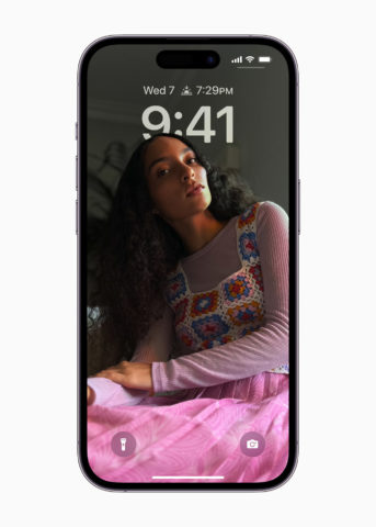
The new Pros add new features too. Outdoor brightness is vastly improved, making it easier to see what’s on the screen. And the always-on display shows off a clock, widgets and a dimmed version of your background wallpaper when your phone’s idle. It’s strange at first, but soon proves effective.
Cut out for this: Dynamic Island
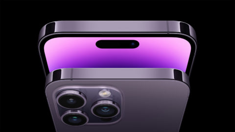
We’d long heard rumors Apple was to replace the notch with a pill-shaped cut-out and flanking ‘hole punch’. No-one guessed the company would turn a screen cut-out into a virtue. But that’s Dynamic Island.
The important word is ‘dynamic.’ Apple uses software to trick you into thinking this area is alive. Music and podcast apps minimize into it, as do timers. Tap-hold and you can access controls. Alerts appear there too, with the island expanding as needed to display information. It almost feels like a second screen.
The illusion only briefly breaks if enough light hits the display to reveal the outline of the hardware components. But before long, you’re sucked back in. Dynamic Island alone still isn’t enough to make you go Pro, but it’s a great bonus if you do.
Chips are down: Performance
Until this year, every new iPhone had the same chip. That’s no longer the case. The iPhone 14 sticks with a slightly upgraded version of last year’s A15. New Pros get the A16.
Apple’s not saying why this decision was made, but ongoing global supply chain issues might be a factor, along with a desire to further differentiate the flagships phones. Given how far behind Android chips are, there‘s little danger right now in Apple ‘holding back’ gains from some phones for a year.
In use, though, you won’t notice much difference. An A15 was already more than enough for pretty much any task. The A16 is another level of overkill. Still, Apple says the A16 also helps drive the 48MP camera and Dynamic Island – and any iPhone 14 Pro owner will certainly notice those.
Dead weight: Design and dimensions
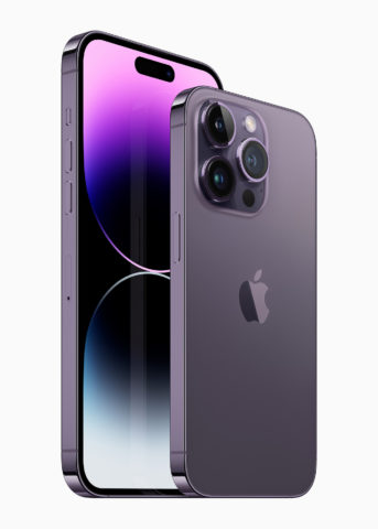
The iPhone Pro is more premium than a standard iPhone, but that doesn’t necessarily make it better. The stainless steel edges are beautiful and shiny, but stainless steel is heavier than the aluminum used on the iPhone 14 and more prone to fingerprints.
The difference isn’t massive: a Pro weighs 206g/7.27oz vs 172g/6.07oz for the iPhone 14. But in a handheld device, that extra 20% is noticeable – and the Pro Max is even heavier at 240g/8.47oz – which you very much will notice in day-to-day use.
The iPhone 14 Pro also looks boring in its oh-so-tasteful black, gold, silver and dark purple (read: almost gray) hues. Mind you, the iPhone 14’s hardly a blast of vibrancy, unless you go for Product Red. We miss the days of the colorful iPhone XR.
Maxed out: Unique Pro Max features
If you pay extra for the Pro Max, a bigger display is the most obvious difference: 6.7in vs 6.1in. This means you see more on the screen at any given time. It used to provide additional benefits in landscape too, but Apple’s moving away from two-pane interfaces, in favor of temporary slide-over sidebars. A few apps (such as NetNewsWire) have stuck with the older design.
Size is another consideration when pondering buying Apple’s largest phone. At 160.7mm/6.33in x 77.6mm/3.05in, the Pro Max is relatively unwieldy compared to the Pro (147.5mm/5.81in x 71.5mm/2.81in) or standard iPhone 14, along with being less pocketable and less suited to one-handed use.
One advantage, though, is the bigger battery that Apple can fit into the larger frame. This means a Pro Max can outlast smaller iPhone models by hours.
Verdict: Go Pro – if you can afford to
If you’re in the market for a new iPhone and are weighing up going Pro, this is the year to do so. It demands a premium (£250/$200), but the extra outlay is justified in what you get: a superior camera; a better display; more raw power; and, yes, Dynamic Island.
Should you go Pro Max? That’s trickier. It’s objectively the best phone Apple’s ever made, yet it’s bulky – and very expensive, starting at $1099/£1199. Unless you have to have that extra screen space, save a hundred bucks and go for the standard Pro.
However, $999/£1099 as a minimum for a new phone (that’s for the cheapest 128GB iPhone Pro) will also be too much for some. If that’s you, don’t jump at the iPhone 14. Instead, consider the still on-sale iPhone 13, which starts at $699/£749 and has a feature set almost as good as the newer model.
