Craig Grannell is (mostly) won over by the most obvious feature in a watch
Last year’s Series 4 rekindled my interest in Apple Watch. The larger display was eye-catching, with a face you could pack with ‘complications’ widgets. I duly did so and never looked back.
My app use diminished, but I used the watch more often for information: checking on exercise metrics; receiving eBay alerts; and obsessively checking the weather – as all British people are bound to do by law.
It felt a big ask for Apple to make this device meaningfully better.
Screen time
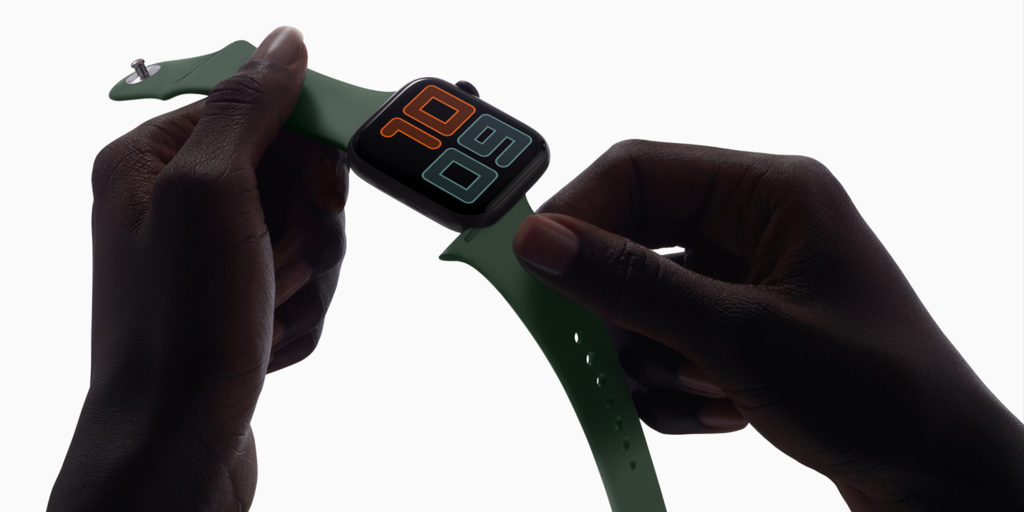
Entertainingly, Apple’s big new feature is the most obvious for a watch: an always-on display. But this is a technical marvel, given how a smartwatch’s display saps energy – unlike a power-efficient LCD, or something that uses mechanical parts.
In use, you spot the screen subtly dim as the refresh rate drops to just once per second. Interact with your watch or merely raise your wrist, and it quickly returns to normal. After several years of Apple Watch use, this feels revolutionary.
It’s absurd to be championing looking at your watch without first doing a comical wrist flick, but here we are.
Bit of a blur
The snag is, this new feature is limited. I got a pang of disappointment on straying beyond a watch face or Apple’s Workout app, whereupon Apple instead blurs the app and places a simple digital clock over the top. Some apps also take precedence, even when you’ve already switched back to a watch face.
I’ve mixed feelings about two other big new features as well. A standalone App Store is fine, but I’ve barely used it. Even the prospect of no longer having to install iPhone apps that have Apple Watch versions isn’t compelling, since most decent Apple Watch apps are worth having on your iPhone anyway.
Noise annoys
But I’m keener on the new Hearing app, which should alert me when I’m in the process of being deafened – and I wish this could be beamed back to my younger self, prior to getting tinnitus.
That said, I wonder if this and/or the new screen tech are responsible for the hit to battery life I’ve experienced over the Series 4. My Apple Watch never fails to get through the day, but has less juice in it before being attached to a charger at night.
The Hearing feature and always-on display can be disabled, which may counter any such issues; but it seems daft to shut off the best bits of Apple’s latest model. (Neatly, though, the always-on display does automatically shut off when your watch is connected to the charger, rather than lighting up your room at night.)
Verdict: Apple Watch Series 5
Last year’s watch felt revolutionary; this year’s feels transitionary. The always-on screen is an odd mix of flawed (in that it doesn’t work everywhere) and fantastic (in that it exists at all). It points to the future, but doesn’t quite get there. That said, Apple Watch remains a genuinely useful piece of hardware – especially for anyone who regularly tracks health metrics or relies on notifications.
It’s hard to recommend the Series 5 if you have last year’s model – unless you absolutely must have an always-on display. But in combining the Series 4 redesign and new usability enhancements, the Series 5 is a compelling option if you’re still wearing – and regularly finding useful – an older Apple Watch.

