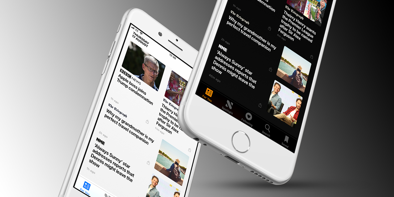
iOS 11 will be released in a month or so, but in the meantime, those willing to risk a slightly buggy experience are already beta testing the new features. One in particular has caught our eye recently, offering the closest thing we’ve seen to the ‘dark mode’ users have been clamoring for.
Smart Invert is a new accessibility feature designed to make it easier for people with certain visual impairments to use iOS. It inverts the colors of the display to make menu and icon text easier to read, swapping white backgrounds for black and so on. If you have iOS 11 installed you can try it out from Settings > General > Accessibility > Display Accomodations > Invert Colors > Smart Invert.
Of course, iOS has rocked a color invert option for years, but previously it would reverse the colors of everything on-screen – meaning images, videos and icons looked really weird. It wasn’t good for consuming media. Now, though, Smart Invert does the same thing for the user interface while leaving alone multimedia content that needs to keep its original hue. It also leaves alone apps that already have a dark theme.
The result is not just a useful accessibility feature to improve legibility, but its darkening of all menus and backgrounds makes it pretty usable as a makeshift ‘dark mode’ for iOS. Great for use at night when the usual bright whites of the interface can be a bit too much to handle. It has a few quirks, and an official implementation of dark mode would still be very welcome. But in the meantime, this is a decent alternative and will be available to all users upon upgrading to iOS 11.
It’s a bit of a pain to dig into the Settings every time you want to toggle this on and off, so we’d hope Apple will give us the choice of a quick shortcut in Control Center once the final version of iOS 11 is ready. Thankfully, though, it’s possible to set Smart Invert to switch on or off with a triple-click of the Home button, which is handy for anyone likely to use the feature often.


