Our hope that an era of reductive minimalism is over – and one with more buttons is imminent
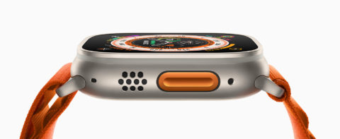
The Apple Watch Ultra is lovely for all kinds of reasons, but the one that really stands out is a new button. Along with the Digital Crown and side button – both of which now protrude a little more so they can be easily used while you’re doing extreme things on mountains or underwater – there’s the Action button. And there are two reasons to be excited about that, beyond its natty orange color and fun name.

First, it provides optimism regarding a shift in Apple’s priorities when it comes to industrial design. Under former design head Jony Ive’s stewardship, Apple became obsessed with minimalism – to sometimes detrimental effect. Notably, the MacBook Pro’s escape and function keys were replaced by a touch-sensitive strip hardly any developers meaningfully supported. And while the removal of physical controls worked better elsewhere – allowing iPhone and iPad to go ‘all screen’ – rumors pervade that Apple’s not done.
Button up
There’s speculation Apple is interested in eradicating buttons entirely and replacing them with haptic equivalents. Those would be easy to set off in error, and sub-optimal when software doesn’t play ball and you need to reset your device. But Apple Watch Ultra suggests Apple might be happy to stick with buttons after all. Here’s hoping.
Secondly, this device indicates Apple might now be happy to cede a small amount of control to the user over what actions hardware buttons perform. The Action button can be customized – it’s down to the user to determine what it does, choosing from a small selection of options that includes Workout, Stopwatch and Backtrack. However, with this system being open to developers – and some features allowing further actions on a second press – customization has plenty of scope.
In control
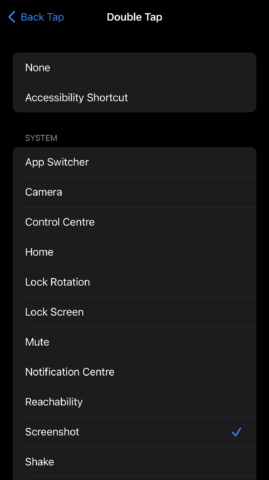
This is something Apple should allow more of, not less. The company has historically – and rightfully – kept a tight grip on its mobile platforms. But we’ve also seen how affording users the means to meaningfully customize elements of their devices, albeit in a sometimes limited fashion, can be transformative. On iPhone, the new Lock Screen has brought much joy. And there’s also Back Tap, which sort of brings a virtual customization button to iPhone, allowing you to trigger actions by tapping the back of your phone two or three times.
The problem with that feature is it’s hidden away, aimed only at people with accessibility requirements. It also lacks the flexibility to allow you to quickly set it up to launch a specific app, or perform different actions in different apps.
So Apple should be bold. We don’t need devices peppered with buttons, but an Action button on every other Apple Watch wouldn’t go amiss – and nor would something similar on iPhone and iPad. It needn’t be bright orange, but it should be obvious and available to all. And if such customization features must remain gestural rather than be tied to physical controls, Apple should at least stop burying them several layers deep, in an area of Settings most people don’t even know exists.


