Home sweet Home Screen? Nope – Apple’s design is far too annoying
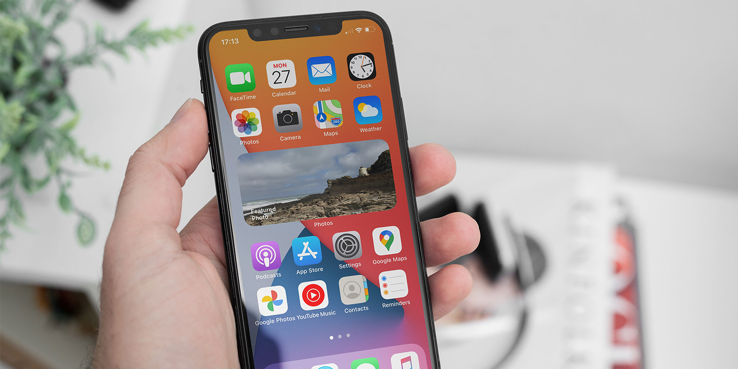
When the iPhone debuted, the Home Screen was a slice of magic. You could rearrange apps however you liked. As you dragged one around, the others would politely get out of your way – and subsequently reorder themselves when you found a place for the one you were moving. Favorites could be stored in the Dock, meaning they were always accessible even when you had multiple pages of shortcuts.
If all that sounds familiar, it’s because the iPhone (and, by extension, iPad) Home Screen system has barely moved on in a decade and a half. And that’s a problem, because it doesn’t scale. When you’ve more than a handful of apps, the iOS/iPadOS system becomes fiddly and awkward. It’s too easy to accidentally shunt an app icon off a Home Screen and thereby disrupt every one that follows it.

Widgets: great until you need to rearrange them.
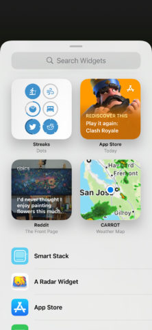
Things are even worse now widgets are part of the mix. Although the concept of Home Screen widgets is great, the reality of organizing them is not. Moving them around is an exercise in frustration, especially on the iPad where you must define separate layouts in portrait and landscape. And should you have the audacity to remove a widget, you’ll fast find app icons from subsequent pages eagerly fill new gaps, messing up any carefully crafted layouts.
With iOS 14 and iPadOS 15, Apple provided an alternative for app access and launching: App Library. This automatically groups apps into folders and has a search field that gives you an alphabetical list of every installed app that you can quickly filter. But it’s strange that Apple hasn’t provided more options for the Home Screens themselves.

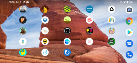
Android gets that phones are used in landscape too.
If we head to other platforms, we see how limiting and frustrating iOS and iPadOS are in this regard. In Apple’s own macOS, Finder’s Applications folder can have is icons ordered and sorted in a range of ways. (The Mac also has an iPhone-like launcher called Launchpad, but modern Macs don’t even provide a shortcut to it on their physical keyboards, suggesting what Apple’s Mac teams think about that particular feature.) Android lets you place icons wherever you want on its Home screens – and they don’t move – along with allowing you to rotate a smartphone’s Home Screen to better use it in landscape.
Apple shouldn’t clone any single one of these ideas – it should make use of them all. Leave the default set-up as it is, but provide options for people who want more flexibility. We should be able to move an iPhone into landscape and not have to turn our heads 90 degrees to use its Home Screens. We should, with a couple of taps, be able to sort our apps. And if we’ve spent time meticulously placing icons across multiple Home Screens, we should be able to move or delete a widget without everything being upended.

