Apple’s latest interface innovation further blurs the line between hardware and software
Of all Apple’s primary goals, the one that’s been most overt during recent years is how the company strives to make technology invisible. You see this in the way iPads have evolved into nondescript rounded rectangles, lacking even an Apple logo on the front. Similarly, the design of the most recent iMac seeks to have the computer blend into its surroundings – or at least not stick out like a sore thumb within the home. It’s a far cry from the intrusive beige boxes of the 1990s.
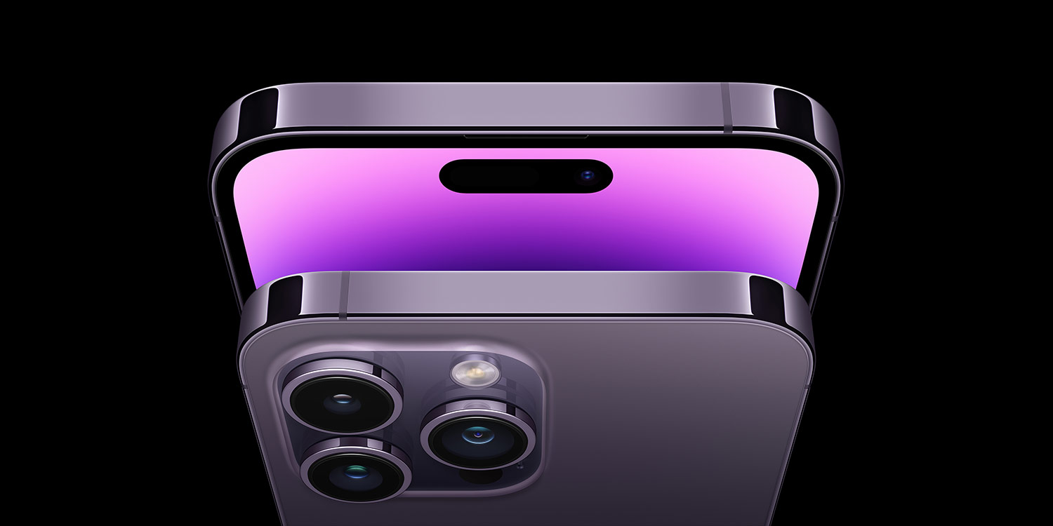
What, then, when Apple is faced with an intrusive element in the most-used of its devices, the iPhone? With the iPhone 14 Pro, rumors correctly guessed that Apple would seek to lessen the negative impact of the front camera system by replacing the notch with a pill-shaped cut-out. What no-one predicted was how Apple would use a screen cut-out – one of the most disliked elements on modern smartphones – to further blur the line between hardware and software, resulting in something surprisingly delightful.
Treasured island

Dynamic Island turns a screen cut-out into a vital interface component.
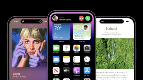
Apple being Apple, its cut-out has a lofty name: Dynamic Island. But if you manage to stop your eyes rolling to the degree they fall out of their sockets and right across the room, you’ll discover Apple has done something very smart indeed. Instead of trying to hide the fact that an all-screen phone has a hole in the screen, Apple has turned the pill – sorry, Dynamic Island into a core part of the interface.
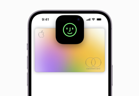
Instead of being dead space, it’s alive. Notifications burst forth from it, expanding when necessary to convey vital information, or even splitting the island in two if there’s more than one thing to track. With a tap of your finger, Dynamic Island can expand, providing you with additional context, or controls for music playback.
It’s a creative solution. Android phones have had cut-outs for years, but no-one has ever attempted to make a virtue of one before. To do so feels very Apple.
Dynamic future

Animations are unique, helping to differentiate interactions – but they are also a distraction.
There are questions of where all this next heads. The system has received widespread acclaim, but it can be a distraction when notifications arrive. The fluid, bouncy animations will prove divisive – considered playful by some, but problematic by others. And there’s the temporary nature of an interface element advances in technology should eventually render obsolete. You can’t imagine Apple doesn’t have its sights set on a future iPhone where there’s nothing to blight the iPhone display, and the entire camera ‘magically’ sits beneath the screen.
For now, though, Dynamic Island feels like an elegant response to an inelegant problem – a rare case of embracing and evolving rather than trying to gloss over or hide a literal hole in a phone’s screen. And while certain commentators might scoff at the praise being heaped on Apple for its smart idea, the truth of design’s impact can be found in how rivals and advocates alike react. We’re already seeing Android manufacturers aping Dynamic Island, and enterprising Apple fans mulling over whether it should exist on devices that don’t even have a hole in the screen. That says everything.

