An ear-resistible noise app that drowned out the chaos of the world
The latest entry in our classic app series invited you to make some noise – but only to drown out the hubbub of the world around you. (Shhhh!)
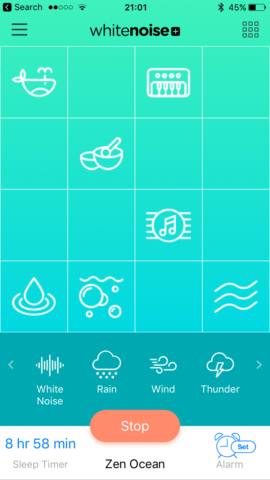
White Noise+, circa 2016
What was White Noise+?
An ambient sound player and mixer. It let you combine ambient noises to make a relaxing soundscape that might block out the world while you – or anyone else within earshot of your device – were trying to relax, study, meditate or sleep.
Why was it a classic?
In short, the interface. Whereas rival apps mostly had you select sounds from a list, and were often ruined by other distractions, White Noise+ felt like something Apple would create itself. It was all minimal icons and sleek gradients. And the way you combined sounds by dragging them around a simple grid was smart, intuitive and flexible.
Where is it now?
Still on the App Store. It’s testament to the app’s original design that although it doesn’t look much different today from how it did in 2016, it still feels fresh and modern. Most importantly, it remains fantastic to use, with its dozens of sounds, iPad and AirPlay support, background audio, sleep timers, and more.
Get White Noise+ (free or one-off lifetime IAPs) from the App Store.
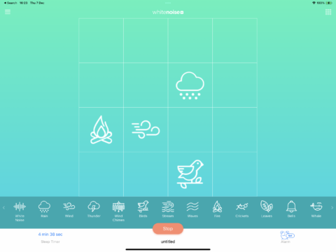
White Noise+ today, on iPad
Q&A: a brief history of White Noise+
We speak to White Noise+ creator Joe LeBlanc about what makes a great ambient noise app – and why he made this one.
What sparked your interest in white noise devices and apps?
Joe: We were living in a small house in the city with our two young boys and used many different white noise solutions to get a good night’s sleep – and prevent waking them while we did chores during nap time!
Almost every app I’ve produced is a result of a problem I needed a solution for – or something I was personally obsessed with. White Noise+ was no different. I was using so many different white noise apps and it seemed like there was room in the market for something new.
What was your approach when you created White Noise+?
I did intentionally set out to do something different from what I was commonly seeing in the App Store. And I wanted a way to quickly and easily mix sounds so each user could create their own perfect soundscape. I wanted almost every interface element to be on the app’s main screen, so people could immediately dive in, mix and remix without needing any menus.
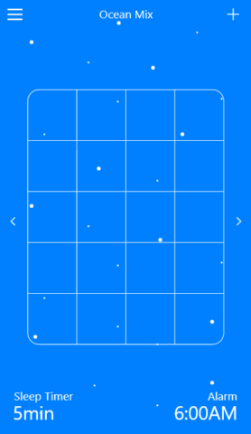
The earliest concept sketch of White Noise+
What were the key features that had to be there from day one?
Easy and creative sound mixing and easy access to presets. ‘White Noise’, ‘Rain’ and ‘Wind’ are my go-to sounds when I sleep, but I also wanted more atmospheric sounds that could be used in other settings, such as bells, drones, chords and other melodic elements. A preset we include with the app is a mix of Tibetan bowls, chords, drips, bubbles and whale noises. I love how it sounds and think it‘s perfect for meditation or studying.
Where did the minimalist mixing desk design arrive from?
The ‘aha’ moment was, essentially: what if I applied GarageBand’s Smart Drums concept to ambient sounds? White Noise+ works in a similar way, moving sound icons up and down the grid to adjust volume, and left to right to adjust the frequency/complexity of the sounds. I worked closely with a wonderful sound designer, Jared Arnold, to get each variation just right.
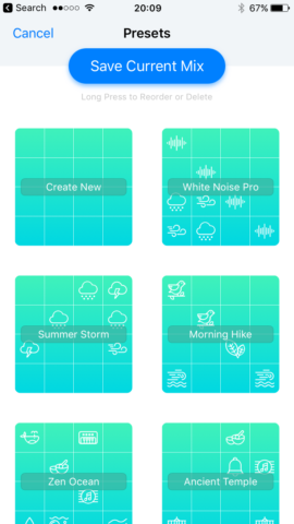
Saving presets on 2016-era White Noise+
Is there anything you’d like to add to the app? And what aspects are you particularly proud of?
There are always things I’d like to add to this app. On my shortlist are new sounds and an improved Home Screen widget.
Proudest moments? When in 2016, White Noise+ was recognized by Apple with a ‘Best of App Store’ award. That was a huge moment of validation for me. And I’m extremely proud of how we were able to marry a minimalist visual design with the smart sound grid concept. It’s such a simple way to create an unlimited number of soundscapes.
