A minimalist app for wordsmiths that’s the write stuff
Some apps are fleeting. Others are core parts of the history of the iPhone and iPad. In this entry in our series on classic apps, we explore a writing app that invited people to think differently about crafting words. Our interview with its creator digs into how the app came to be – and why it’s survived the test of time.
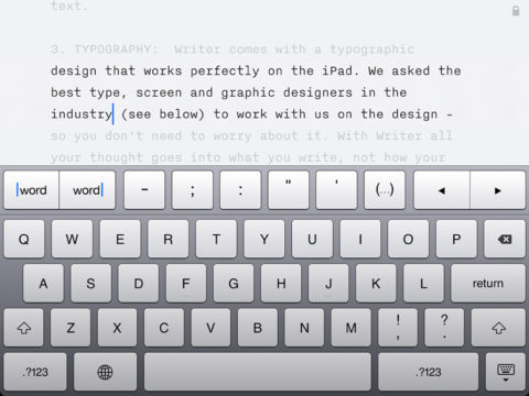
The original iA Writer on iPad.
What was iA Writer?
A minimalist, distraction-free writing app that started out on iPad before expanding to other platforms.
Why was it a classic?
In the same way the iPad invited you to focus on a task, iA Writer invited you to focus on words. It was just you and the page. And through it using Markdown for files, there was no lock-in. Not that writers wanted to go elsewhere after they’d tried it!
Where is it now?
iA Writer remains on the App Store. The latest major release added a slew of new features, including cross-document links, a menu for rapidly accessing favorite commands, Markdown preview split screen on iPad, and document metadata.
Visit the iA Writer website or get iA Writer ($49.99/£44.99) from the App Store.
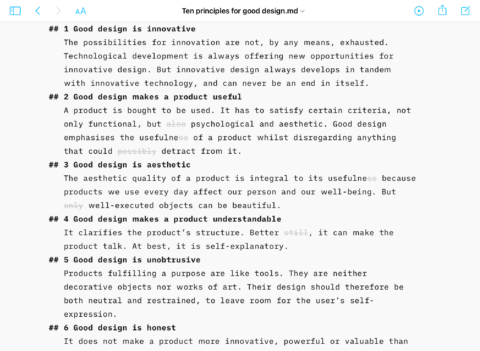
The latest iA Writer – still sleek and efficient!
Q&A: A brief history of iA Writer
We speak to iA founder Oliver Reichenstein about what it takes to make a revolutionary writing app – and make sure its shine never fades.
What was the impetus behind iA Writer?
Oliver: I used to teach Microsoft Office and academic writing. I noticed students wasted too much time on formatting and playing with non-writing-related functions – and that I was no different. Most started by adjusting fonts and margins, typed a bit, deleted a bit, moved text around, and got caught in a loop of fumbling. The time spent thinking before and while writing was frighteningly low. Yet just as when we speak, we write much better when we think before and while we express ourselves.
As a student, I bought a typewriter to see if it could help me focus while writing – and it did. There’s not much else you can do with a mechanical typewriter other than think about what words you want to form next. And because your fingers soon start to hurt when typing, that pushes you to find a good twist to successfully end a poorly written sentence. Restrictions can be surprisingly helpful!
Years later, I felt it was time to see if something could be done about writing with computers.
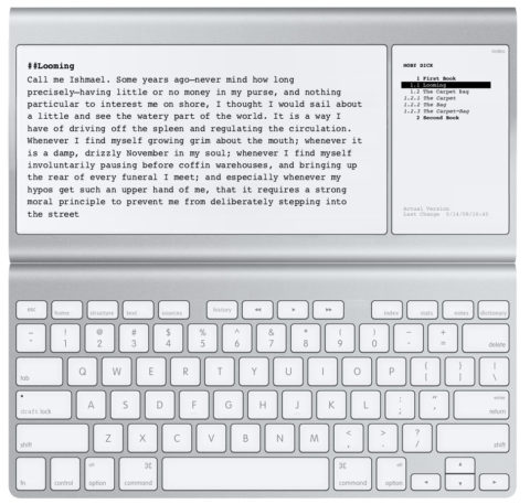
Concept art for iA’s Writing Machine.
So how did your app come about?
At first, we planned to create our own device – just for writing. No internet. No email. No notifications. In January 2010, as we were designing our ‘Writing Machine,’ the iPad came out. Overnight, our plan had become much more manageable. We suddenly only had to make an app!
One issue of writing on a computer is constant distractions. The early iPad had a much more focused interaction model: one app at a time and no windows. We liked the iPad right away because it almost did what we’d thought up for the writing device. For focused writing, it’s still the best – and with a keyboard looks and feels like a contemporary typewriter.
How did you balance minimalism with the features demanded by writers?
From the very beginning, we wanted three features: Syntax Highlight, Style Check, and Focus Mode. Getting there, we learned a lot from code editors. For example, Syntax Highlight offers an X-ray on what you write, doing for natural language what coding tools do for code.
But providing focus doesn’t mean being minimal on features. When we introduced iA Writer, it had a lot of completely new and unique features – and it still does. No-one comes close to what we do with our typographic engine.
What guides the features you add?
Our basic guideline is we preserve the original, focused, pleasant writing experience of version one. Outside the canvas, we had to make compromises. We had to introduce settings because, as the audience grows, the needs become so varied you have to offer some choice.
When it comes to the identity of an app, what you do not offer is as important as what you do offer. Not letting users set fonts was a clear statement: Focus on the words. Deal with design later.
However, we are also very proud of the typographic experience in iA Writer and go to great lengths creating and fine-tuning our app’s built-in fonts. Only type nerds will notice, but that’s the point. Good design gets out of the way, so you can focus on your tasks. In iA Writer, you do not need to think about fonts and colors – you use all your brain power to write the best you can.
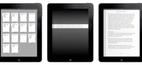
Early iA Writer sketches.
How have you over the years responded to user requests?
We get a lot and have internal lists to track them. We then compare feasibility and benefit. If something is easily done and has a clear benefit in terms of focus or the writing experience, it gets prioritized. Because we are a small team and support a lot of platforms, we have to choose carefully.
Plus, over the last 12 years, we said goodbye to deadlines and pressure. We constantly work on the app and compete on quality of features, not number. Before something new launches, we make sure it has iA Writer quality and that it is thought through and tested as much as possible.
iA Writer has survived where ostensibly similar products have not. What sets your app apart to ensure its longevity?
We use our apps daily. Everyone on the team understands and loves what we are building. We all read user feedback and are very much aware of why and how people use our apps. We listen closely.
At the same time, we give our best to resist all pressure and do what is right. Selling apps is a tough business, and everyone tries to put you under pressure to do with your app what they think needs to be done. Be it economic, technical, or political, we are suspicious of hype and supposed musts and must-nots.
We put in as much time and energy into shaping our apps as necessary, and if a seemingly tiny feature takes ages to finish, well, then it just does. It’s not easy to resist pressure and say no to Apple, Google or customers; but, over time, it shows if you believe in what you do – compared to those who just want to make a quick buck.
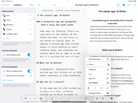
Some version 6 features – which are only visible as and when you want them to be.
Finally, what is your favorite feature from the latest release?
On iPhone, dealing with files is always tedious because of limited space. Wikilinks made the file browser on a handheld almost irrelevant. I hardly leave the text view anymore, and this has made it so much more natural to write on the phone.
New Lightning Menu and swipe gestures support that stay-in-the-text perspective. They allow me to have the keyboard and the text always open in the exact same status, without the need to ever change my focus. These features have been designed together with the explicit purpose of creating a handheld writing device where you keep your mind in the text for a very long time.
I write on the way out of the door; I write on the bus and in bed; I write whenever I get a minute. The only downside is since the first beta of iA Writer 6, my screen time on the phone has kept going up. But I don’t mind because, when I write, I do not consume content – I use my brain and I create things. And unlike passively browsing Reddit, that feels fantastic.
