The app that let you create sonic magic without lifting a finger – you just had to put one down
Some apps are fleeting. Others are core parts of the history of Apple’s mobile devices. In this entry in our series on classic apps, we dig into a synth that shook up music apps forever and allowed anyone to experiment with sound.
What was Animoog?
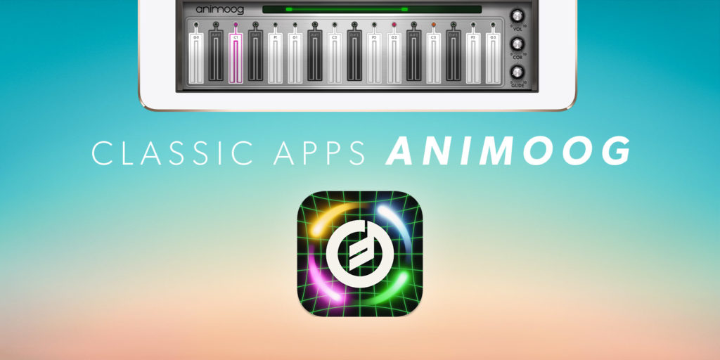
It was a synthesizer, initially released for iPad in 2011, and then for iPhone the following year. Although to call Animoog a synthesizer underplays its revolutionary nature. It had keys to press and parameters to change, but didn’t merely seek to remake existing hardware for the touchscreen and work within rigid conventions. Animoog was something different.
The original Animoog for iPad
Why was it a classic?
Animoog’s approach and attitude were key. The touchscreen interface evolved the traditional piano keyboard into something more engaging, expressive and approachable. With a single finger, anyone could generate amazing sound; slide your digit and the parameters of what was being played would change in real-time. Visually, the app was a treat too, with graphical interpretations of what you played, while the classic Moog sound underpinned everything.
Where is it now?
The original Animoog app received many updates before it was recently retired. Moog has since replaced the app with successor Animoog Z – a universal app that builds upon its predecessor and that’s entirely free.
Visit the Animoog Z website or get Animoog Z (from free) from the App Store.
Q&A: a brief history of Animoog Z
We speak to Moog software lead Geert Bevin about the birth of Animoog and the secret of its success.
What was the genesis of Animoog?
Geert: Moog engineer Cyril Lance and sound designer Drew Neumann had this idea of a synthesizer where everything was always in motion, where comets would orbit three-dimensional paths. They didn’t know how to make that a reality with available hardware, but then iPad arrived. It dawned on them the multitouch display would allow a two-dimensional interpretation of their idea.
The expressive keyboard locked to scales, so you couldn’t play a bad note
What do you think made Animoog unique?
Everything was designed to be engaging and expressive, but the key goal was to open up sonic exploration to as many people as possible, without limiting it. The visuals drew you in, including the virtual knobs and CRT screen. Then there’s the keyboard. Partly inspired by the Buchla touch keyboard, it was the first of its kind – a really novel way to interact with sound.
The idea was to create a very expressive keyboard, where it felt like you were touching the sound that was moving. And it was tied to specific scales, so you can’t play a ‘wrong’ note. This made people more engaged with the sound, and we saw all kinds of people playing Animoog, from babies pulled in by the motion and colors, to Asian musicians keen on using it for specific tunings. It touched a very wide gamut.
Many early iPad synths vanished. Why do you think Animoog survived for so long?
It goes back to that low barrier to entry. You could put your fingers down and something interesting would happen that was immediately engaging. In that sense, it’s almost a game – a sonic and visual one, with endless possibilities. Once you’re hooked, how far does it go? People would discover more of the app’s concepts and be inspired by them.
Also, a lot of knowledge of analog instruments was translated into the app, which wasn’t common at the time. We used legacy Moog equipment as a source for the foundation of sounds, so there was a connection to the past through visuals and audio, combined in a way that created something new. It was the product of thousands of small decisions from decades of experience, coming together to make a satisfying, engaging, low-barrier app.
Animoog Z takes the synth into the third dimension, and is free for iPhone, iPad and Mac
Why did you replace Animoog with Animoog Z?
Animoog was written for the first iPad, which is a dinosaur in computer years. We kept updating the app, but it was clear the state-of-the art foundational technologies we used in 2011 were being phased out. We also wanted to bring Animoog to Mac and let it run as a plug-in inside digital audio workstations. So we asked ourselves what we needed to do to make that happen.
The only option was to rewrite it, and so we reimagined the app, adding things we couldn’t back in 2011 because the first iPad wasn’t powerful enough. Animoog Z is actually closer to the original vision of Animoog, giving you a three-dimensional space to explore with sound. Yet it’s also faithful to the original, so existing users can feel at home.
We also decided to lower the barrier to entry even further. Everything is available in the app’s initial panel: you can use the built-in presets and import 8,000 community ones, play, explore what’s possible and save your changes. Animoog Z is a fully functional synthesizer, entirely for free.

