Procreate 4 arrived last month with some hot new features, and with an update for Procreate Pocket on the way we asked illustrator James Boswell to give us his thoughts on both versions of the digital painting app.
Procreate is a completely different beast depending on which platform you use it on. It’s probably easiest to think of the differences between Procreate 4 on the iPad and Procreate Pocket on the iPhone as different drawing tools that share some of the same DNA.
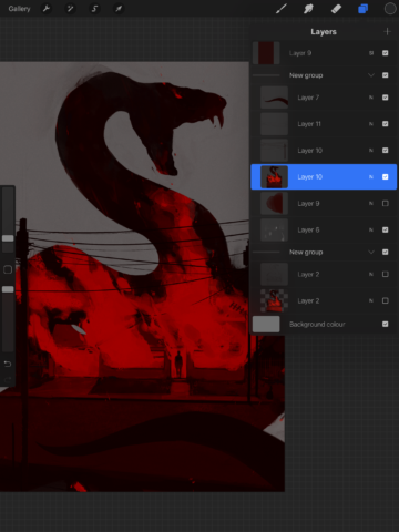
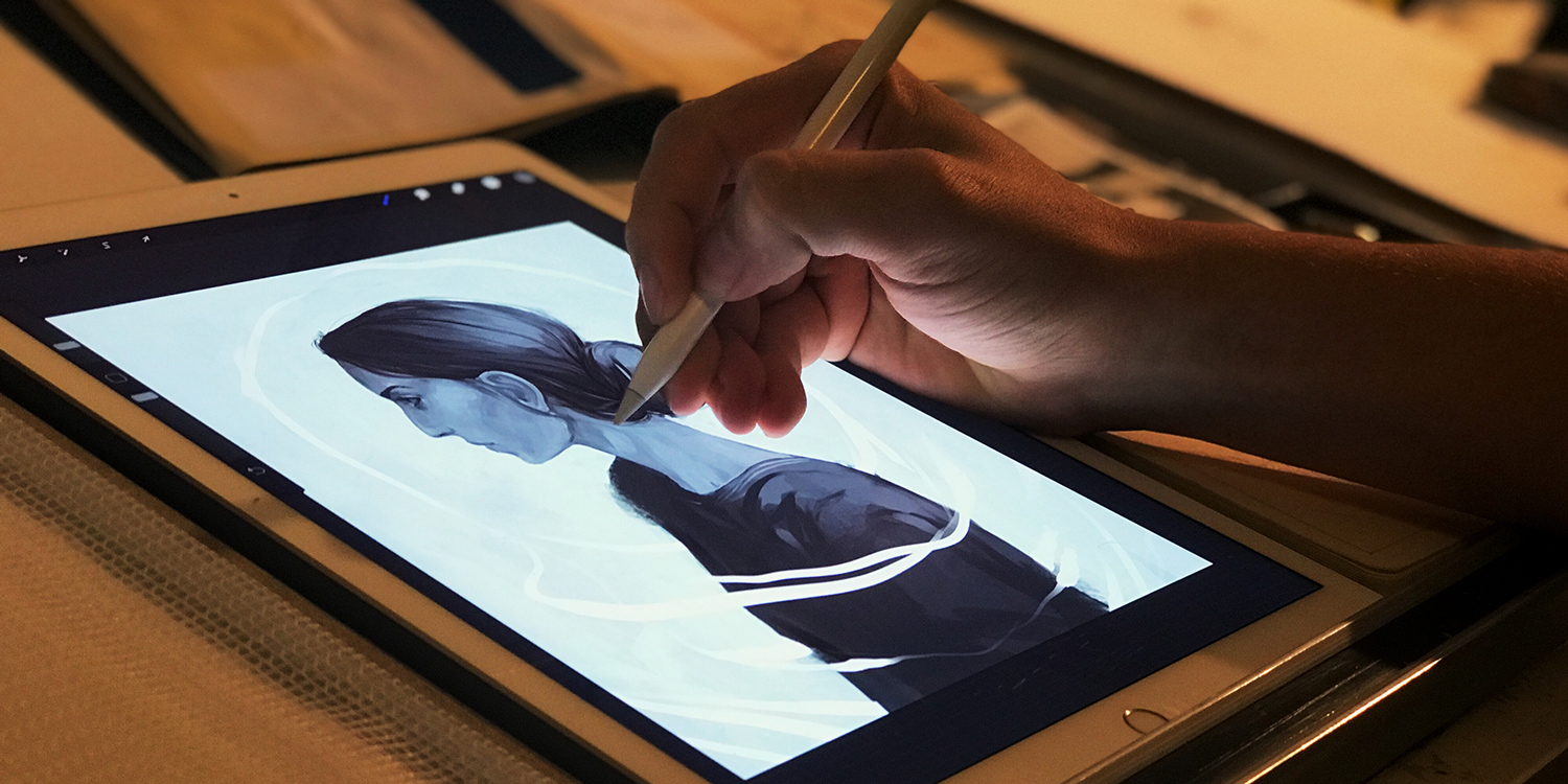
Procreate 4 – exclusively for iPad – is a professional piece of painting software good enough that I’ve switched to using it as my main software for producing illustration work, and recently the artist James Jean created this brilliant poster for Bladerunner 2049 using it.
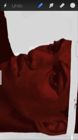
Procreate Pocket – the cut-down iPhone version – has the advantage of being in your pocket wherever you are, and if you’re keen to jot down an impression of a place or pull together a palette inspired by something you’ve seen then it’s a fantastic extension to any artist’s toolkit.
Both apps have the ability to import photographs as reference or as an element of a painting, and with the mobile version this proves to be particularly useful.

Procreate 4 has upgraded to a new engine, Silica M, which was built entirely with Apple’s Metal graphics platform and is noticeably faster than it’s predecessor. It also allows for far better paint mixing, producing realistic wet textures that can’t be beat. The range of colors available has been vastly expanded in the move to P3 wide color and the palette system has been entirely overhauled, now allowing for far more control over color schemes and color accuracy.
Perspective assist is finally included fully in Procreate 4 and I would say it’s one of the most useful tools Procreate has to offer. Hopefully it’ll be coming to the iPhone version before long. It makes laying out any object in 3D space much easier and used in conjunction with the quick line tool allows for fast technical drawing.

One thing both versions of Procreate could benefit from would be a little more clarity when it comes to making the most of its functionality. I’ve been using Procreate for the last three months and am still finding fairly obvious tricks, tools, and functions that would have been useful when I started. It’s enjoyable to learn these ins and outs though, and while there’s certainly a learning curve, a more robust help section would definitely be a plus.
The developers have promised to move their attention to Procreate Pocket next, and there are a couple of features I’d love to see shared from the iPad version when the next iPhone update arrives. First among these is the smoothing tool for lines, which allows the line to trail a little bit behind the stylus, much like the bristles of a brush. This creates a much more natural and flowing line, something that’s easily achievable on paper but not quite as easy with digital work. Secondly, it’s fairly confusing trying to export images from the app to share online or with others, so including Procreate 4’s swipe system would help make Procreate Pocket a much more powerful tool.

Ultimately, I think any artist or illustrator would get a lot out of Procreate 4, and it’s both easy enough to use and cheap enough that it makes a great introductory tool to anyone who wants to try out digital painting. So far as Procreate Pocket goes, I think that whilst it makes an excellent addition to the artist’s pencil case, it is a spot too fiddly at the moment to be considered a serious art tool. The bigger screens of the Plus model iPhones certainly help, but its the extra features and Apple Pencil support that make the iPad version the superior app.

