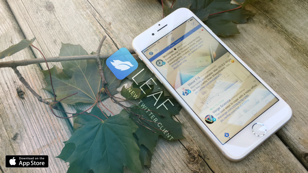
Leaf attempts to take Twitter’s iOS design to a new level
Price: $4.99 / £3.99
Version: 1.0.1
Size: 15.5 MB
Platform: iPhone & iPad
Many will ask, why do I need a Twitter client, let alone a paid one, when the official app is available for free? It’s a good question to ask, but for those that want a bit more functionality, a Twitter client can be a good investment. One of the major issues with the main app is that Twitter introduced an algorithm awhile back that puts certain Tweets to the top of your timeline – a ‘While you were away’ feature. This can be useful for some, but it’s not for everybody, especially those that believe Twitter’s whole selling point is instantaneous updates and a constantly updated feed.
Leaf doesn’t really bring anything new to the Twitter client game in terms of features, but its attention to design is something to be celebrated. Take the setup screen as an example – while loading your Twitter account, the light blue background shows falling leaves, and they fall in the direction you tilt your phone, based on the iPhone’s accelerometer. That right there, is the kind of creativity so frequently missing.
While the regular app, and other clients like TweetBot present tweets in varying sizes based on the links, images and videos associated with it, Leaf attempts to merge photos and tweet text. Many have lauded this approach, but it’s not really that effective – let’s not confuse different with good. Merging photos and text generally doesn’t improve the visibility. If the image is of a person their head is generally at the top of the frame and gets faded out as it merges with text. It’s not a great thing for an app that prides itself on visual design.
However, Leaf’s usability is pretty simple once you get used to it, and it’s easy to switch between multiple accounts. It’s fluid and mostly lag-free, though feed refreshes aren’t totally reliable. Also the app’s treatment of GIFs, a prominent image format on Twitter, is bizarre, choosing to play them as non-looping videos that have to be selected rather than auto-playing loops as they’re intended to be. It’s an approach that Apple used to favor, but even they have moved on since those days. It would also be in Leaf’s interests to explore 3D Touch options, or have options for retweeting and favoriting appear underneath a tweet when it’s tapped. It currently goes to a single tweet view, requiring more taps than necessary to interact with a tweet.
Elsewhere, the app’s Dark Mode is as good as Tweetbot’s (which has long been arguably the best Twitter client on the App Store – read our review,) if not better, and also has an auto-night mode setting. We’d also say Leaf’s tweet/photo merge approach works far better in this mode.
More importantly, is it better than the likes of Tweetbot? It’s difficult to say. Sure, Leaf”s a bit cheaper at $4.99, but it’s still not cheap, and Tweetbot frequently puts its app on sale for the same amount. While Leaf maintains this is only the beginning and the app will continue developing, it doesn’t quite have the reputable legacy Tweetbot has. However, Leaf is simpler, and has less features, but that doesn’t mean it’s not a good choice – if you’re not a Twitter power-user, you’ll probably prefer Leaf over Tweetbot’s heavy approach.
In conclusion, Leaf is a decent Twitter client and a solid start. If you’ve never really considered that there is a world outside of the main Twitter UI, where you aren’t forced to read promoted Tweets, or algorithm selected bumps, then Leaf is certainly a great place to start.

