A photo filters app that never cared for rose-tinted specs – it wanted pixelated ones
This latest entry in our classic apps series let you reimagine any image through the lens of retro computing and gaming hardware.
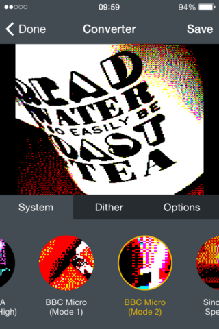
An early version of Retrospecs.
What was Retrospecs?
First released in 2015, this photo filter app let you convert images to look like the output of ancient computer hardware, such as the Commodore 64, classic Mac, or Nintendo Game Boy. If you’d wondered what your face would look like painstakingly recreated on aging hardware by a master of pixels, Retrospecs was the app to go for.
Why was it a classic?
There’s the nostalgia factor. If you grew up during the 1980s and 1990s boom in home gaming, Retrospecs made it easy to transform your snaps and give them pixels so sharp you could cut yourself on them. But the app also deftly balanced immediacy and depth. Behind those one-tap filters was a wealth of options, including custom modes and grin-inducing character fonts.
Where is it now?
Well north of 50 updates later, Retrospecs is still getting new features and optimizations for the latest iOS, making sure it doesn’t become ‘retro’ itself. All these years later, it’s still our favorite filter app for iPhone.
Visit the Retrospecs website or get Retrospecs (free or $3.99/£3.99) from the App Store.
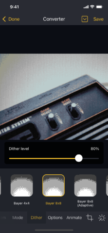
Dither options in Retrospecs 3
Q&A: a brief history of Retrospecs
We speak to Retrospecs creator John Parker about the birth of Retrospecs and how he keeps his retro app current.
What was the genesis of Retrospecs? Why create an app that processed images like they’d appear on early home computers and consoles?
John: In early 2014, I was between jobs and looking to learn iOS development, because I’d had enough of backend ecommerce systems to last a lifetime. I’d always been interested in computer graphics, starting with an animated ‘seagulls’ manual type-in on my brother’s VIC-20 through to digging into the intricacies of ray-tracing while at university. So I started experimenting to see whether I could convert a photo into the ZX Spectrum graphics format.
I knew automated conversion could never create something as impressive as hand-drawn pixel graphics, but was interested to see how close I could get. Those initial experiments grew into Retrospecs, which was submitted to the App Store the day before I started a new job.
Ten years and dozens of updates later I’m still updating the app. At this stage I guess I’m just a glutton for punishment.
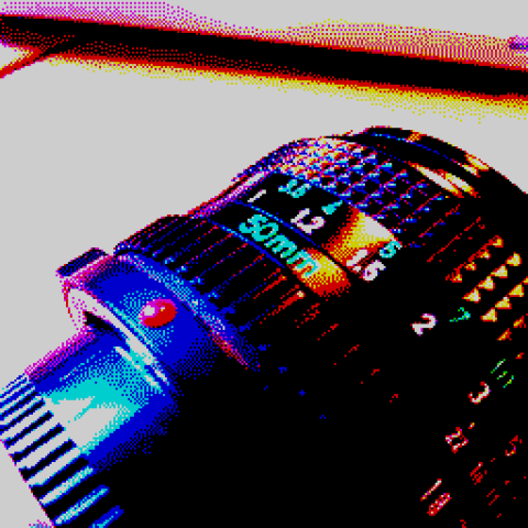
What appeals to you about retro graphics?
For me, computer graphics were at their most interesting when there were fixed hardware or software limitations. It almost feels too easy to impress when you’ve a limitless color palette and can throw endless arbitrarily processed polygons around. In a way, those early machines demanded more from developers and artists because of the constraints they had to work within.
Beyond that, there’s a layer of cosy nostalgia in seeing modern images displayed in an aesthetic you recognize from 30 years ago. Personally, the ZX Spectrum preset is one of my go-tos – and that’s as much down to it being the first machine I used to any extent, rather than any special capabilities it has. It can certainly be hit and miss!
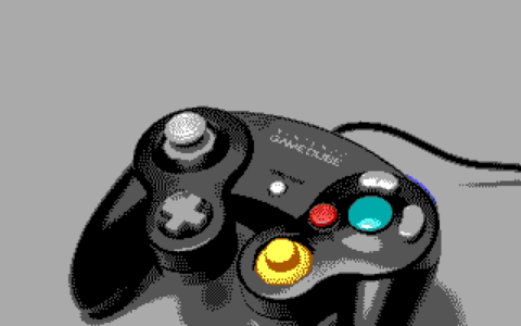
How important was authenticity when working on Retrospecs?
Absolute authenticity was initially a key aim, but over time presets crept in that are more ‘aesthetic tributes’ than strictly accurate. One example is the Apple II Hi-Res mode, which needs NTSC composite video emulation to work correctly – something Retrospecs doesn’t do yet.
Also, what’s really authentic? For most presets, Retrospecs creates images that match what the original hardware was capable of. But even ignoring the original hardware’s resource constraints, the output would have been shown on a CRT or LCD – a radically different experience from a modern Retina display on an iPhone or iPad. Adding an output effects layer to emulate composite video, CRT and LCD is on the to-do list – but it’s a long, long list.
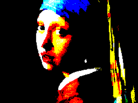
How did you go about balancing immediacy with full-on geekdom regarding tinkering and settings?
I’ve always found that difficult – as user interface overhauls and tweaks over the years perhaps indicate. I think the current approach works well, because you can tweak many settings directly within the converter, and jump into editors to create custom emulations, palettes or character sets if you want to go deeper.
I expect for some people, the amount of options might initially bewilder, but I’d rather expose the underlying potential than offer a basic ‘choose a filter style’ experience. Many of the more interesting results you can get from the app are down to tweaking settings until you arrive at something that appeals.
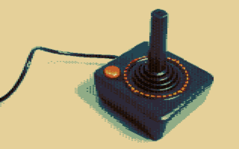
How do you decide which features to add to the app, and which are your favorites?
To be honest, it’s down to time and energy – I’ve mild ME/CFS, and paid work absorbs most of my available energy. The frequency of updates has slowed in the last few years as my energy levels have deteriorated.
But in terms of favorites, I’m a sucker for custom character emulations. I recommend playing around with the character engine options – especially since people like Tim Koch (aka DataDoor/RayManta) kindly let me include their custom character sets within the app.
More generally, the blending options added in Retrospecs 3 are great for creating traditional photography/pixel art mixes, so they’re worth taking for a spin. In short, just have fun with all the tools. Experimentation is usually rewarded with an interesting end result!
