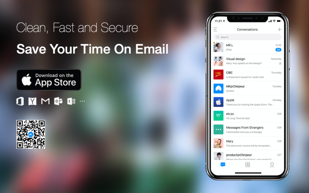
It promises to redefine email, but can Chirp Mail offer a next-gen experience or does the app miss the mark?
Price: Free
Version: 1.1.6
Size: 49.1 MB
Seller: Chirpeur Inc.
Platform: iPhone
Chirp Mail is an email client for iPhone that promises to redefine the email experience through adding a distinct instant messaging flavor into the mix. If you’ve always felt like your email client should feel more like the built-in Messages app rather than the Mail app, Chirp Mail could be for you.
Instant Messaging (IM) apps are everywhere, and generally feature a design that most of us will be familiar with. Picture WhatsApp or Facebook’s Messenger and you’ll get the gist. The thinking behind this app is that this kind of design, including the likes of conversation threads and message bubbles, should be in our email apps, too. Chirp wants to make email less stuffy and more chatty.
So when you launch Chirp Mail and add an account (all the big names – including Gmail, Outlook, and Yahoo! are supported), all your emails are grouped, by contact, into “conversations.” All your messages from Bob, for instance, will be in a single conversation. These use colored message bubbles – and, if possible, contact profile pictures – to show emails from senders and recipients in one single interface. It looks just like an IM message thread.
In theory, this sounds great – you can see the to and fro of a conversion at a glance, scrolling from earlier messages to more recent ones. And if you (and your contacts) are in the habit of sending short, quick-fire messages, this might work well. But in reality, emails are often longer form and heavy on the formatting, meaning the message bubble interface in Chirp Mail can end up looking cluttered, messy, and awkward.
The app does a good enough job of condensing super-rich emails into plain text — usefully, you can easily switch to a full-view of the email using a small Expand button. However, the general feel of using Chirp Mail isn’t great for this type of email.
If all of this is driving you crazy, you can get to a more conventional-looking inbox using the menu button in the top-left of the screen and choosing Inboxes. Here, you’ll see full-sized emails, rather than condensed conversations, and everything suddenly feels right again. But you’ve got to ask yourself: if this traditional email interface is so nice to return to, perhaps the concept behind Chirp Mail’s IM-inspired email is a little off the mark.
The app’s New Chat interface (which you use to compose new emails) does little to alleviate these feelings of discomfort. Tapping the plus icon in the top-right of the screen lets you compose a new email; from here, you’re presented with a list of all of your contacts and will need to tap the one you’d like to message before hitting “OK” at the top of the interface. This does make it easier to set up a group email – you can keep on ticking new contacts in order to add them as recipients – but it once more feels cumbersome when emailing a single person.
There are some nice features on offer here – you can easily block contacts in Chirp Mail, and switching between email accounts is quick and painless. You can tap on an email’s “…” icon to access some useful options, too, like Create New Group, Mute Conversation, or to peg the message as a “sticky” so it’s always within reach.
There’s also a chance that the app’s approach to email “conversations” may really resonate with you – if so, some of Chirp Mail’s shortcomings could well pale into insignificance. Consider this a conditional recommendation – if you wish email was quicker and chattier, it could be for you. And the good news is that Chirp Mail doesn’t cost a dime to use.
However, the old saying, “If it ain’t broke, don’t fix it,” rings true here. The general formula adopted by most email clients works well on iOS and doesn’t need to change. And while Chirp Mail should be applauded for pushing the boundaries, many users may not like what’s beyond them.

