Mailswipe is a great app, but is it a little light on features?
Essentially there are three types of email applications for smart devices. Firstly, there’s the standard here’s your email, here’s a reply button, now get on with it approach taken by the native Mail app and a handful of others. This is good enough for most, but generally doesn’t really integrate with anything else. The second one is the all-inclusive, calendar-boosted, integration-celebrating bumper email client – like Boxer. And thirdly, there are more niche apps – many of which now focus on email triage.
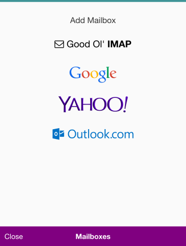
Add email inboxes easily via various platforms
The medical-style term for this may seem odd but that’s essentially what you’re doing with these types of apps – of which Mailswipe is the latest. You’re presented with only your unread mail, which you can then organize using quick swipe-based gestures.
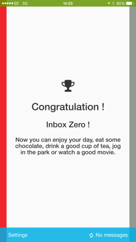
It’s the kind of technique that’s practically essential to those forever on the quest for Inbox Zero.
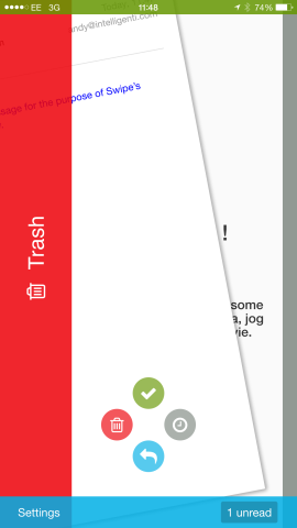
Mailswipe is also designed with read later capability in mind. In this app, all you have to do when faced with a message requiring further attention later is swipe to the right, and it’ll be left unread in your mailbox, but away from your attention in Mailswipe (however, you can retrieve these to view in the app). Inbox full of junk? Simply swipe to the left and it’ll trash the email. Swipe down to reply quickly within the app, and finally, swipe up if you essentially wish to take no action other than to mark the email as read, but keep it in your main inbox.
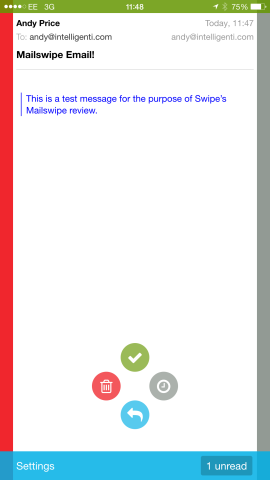
Swipe up, down, left, and right for four different options
Design-wise, the app is simplistic, but pleasantly colorful. It also helpfully retains instructional icons onscreen to prevent you from accidentally trashing when you wanted to reply. However, this is still easily done, and one of the app’s flaws is the incredible frustration when you do this, then have to go into a different mail app to retrieve the message.
A solution to this could either be that Mailswipe maintains a full inbox somewhere under the hood that you could access. This may add a lot more heft to the app, which the developers have probably tried to avoid in the first place – but it would prevent you from having to maintain two or more email apps on your phone. At the moment Mailswipe is essentially an extraneous tool. Another option would be an undo button. Accidentally marked it as read when you really need to reply quickly? If you could tap an undo button it’d come right back.
Functionality-wise, Mailswipe is great at finding and adding various mailboxes. To include more than two, you have to make an in-app purchase. $2.99 / £2.29 will allow you to add multiple inboxes. Another key feature to Mailswipe which will appeal to those with an inbox full of junk is an easy one-tap unsubscribe button, which appears when the app recognizes an email list. However, to access this feature (which may be pretty key to the kinds of users the app will attract), this is also a $2.99 upgrade. Though if you pay $3.99 / £2.99 you can get both IAPs in one.
Neither of these functions is essential to using Mailswipe, but it does add extra functionality which is very useful. However, for that price, we’d like a little more functionality in the app – such as that undo button, or the ability to write a new email.
When it comes to performance, Mailswipe really could do better. We found that it had a tendency to crash a little too frequently, while sometimes it struggled to fetch email. A drag down to refresh function my help, though we’d also like to see functionality to allow Mailswipe to fetch email in the background, while notifications and badges would also be welcome.
We grew to really enjoy the Mailswipe process, and we’d love to take this approach to all of our email activities on an iPhone, but for now we still have to rely on our previous email app. While we realise the developer isn’t trying to make Mailswipe your main email program, the fact is if it had more to it, we’d be more inclined to let it stick around for the long term.
Price: Free (IAPs)
Version: 1.0
Size: 10.4 MB
Developer: Francois Dispaux
