The little iPhone app for tiny notes that made a big impact
Some apps are fleeting. Others are core parts of the iPhone’s history. In this entry in our series on classic apps, we explore an app that provided a place for those little things you never remember and made it easy to get to them – from anywhere.

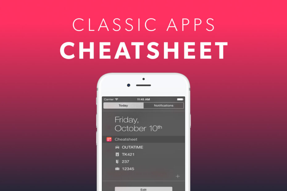
Cheatsheet 1.0 for iPhone.
What was Cheatsheet?
A notes app for information you need often – and immediately – such as door codes, ID numbers, license plates, and network logins.
Why was it a classic?
The app had focus. Instead of these handy reminders being buried in a traditional notes app, they were readily available in Cheatsheet – initially on your iPhone and iPad, and then from other devices too.
Where is it now?
The app continues to be regularly updated and will soon hit version 5.0. It’s available as a free download. A single $5.99/£5.99 IAP unlocks the app’s full feature set.
Visit the Cheatsheet website or get Cheatsheet (free + IAP) from the App Store.

Cheatsheet in the summer of 2024.
Q&A: a brief history of Cheatsheet
We speak to Cheatsheet creator Adam Overholtzer about why he felt the world needed an app for tiny notes, and how he’s kept evolving it to fit the needs of its users.
Where did the idea for Cheatsheet come from?
Adam Overholtzer: I was using a single note in Apple Notes like a wall of Post-Its, which sucked when I needed to recall something. In 2008, my employer started doing security ‘spot checks’ that required our employee ID number – which I could never remember. Unlocking my phone and finding my note was awkward, especially with a security guard staring at me.
When Apple announced iOS 8, with widgets that could present content in convenient, timely contexts like the Home Screen or Notification Center, that seemed like the perfect solution. Make a simple app for logging little bits of information. Then show those notes in an easily-accessible widget. And so Cheatsheet was born.
How did you balance a design that was minimal, immediate, and ruthlessly efficient?
Cheatsheet 1.0 was bare bones, designed for logging quick, glanceable information. It allowed a single line of text for each note. Starting from that extreme helped keep the app minimal. When considering new features, I prioritize those that fit with the core concept: capturing text quickly, organizing notes, and accessing them easily in as many places as possible.

Cheatsheet was a perfect fit for Apple Watch.
How did Apple hardware and software changes impact Cheatsheet?
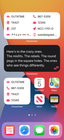
Cheatsheet’s tagline is ‘Write once, recall anywhere,’ so when Apple adds a new ‘anywhere’ Cheatsheet needs to be there. But supporting new platforms is a risk – it took years for watchOS to mature to the point the Watch app was a selling point and my day-one efforts paid off. And sometimes, supporting a change isn’t a choice. When new Home Screen widgets arrived with iOS 14, I had a few short months to revamp Cheatsheet’s core feature. The app lost features the new widgets didn’t support, and so I had to capitalize on new things they offered: fresh designs, easier customization, and multiple styles.
How important was it to allow people to customize lists?
I always wanted Cheatsheet to be simple in day-to-day use, yet highly customizable in presentation and powerful when needed. Icons were there from my earliest sketches – and quickly ballooned in number, due to customer requests. Having an ‘ID badge’ icon, say, rather than ‘employee ID number’, helped make Cheatsheet more glanceable and saved space in widgets. And I prioritized other customization features, such as multi-column lists, colors, fonts, and one-tap delete.
Icons in the first version of Cheatsheet.
What have been your biggest challenges and successes with Cheatsheet?
The Watch app is a success, although that took time. With early Apple Watch hardware, apps were slow, the customer base was small, and modern interface elements we now take for granted didn’t exist. But today, Cheatsheet for Apple Watch is fast, with awesome OS integration.
Syncing with iCloud has been my biggest challenge. It has outages and silent failures, but Apple doesn’t always seem to be aware or to care. But I do! If you’re reading this and Cheatsheet’s sync stops working, let me know through the app and I’ll help you out.
Why has Cheatsheet survived many other note apps?
I think it targets a specific niche and serves it well. Although the app began as a solution to my own needs, it evolved by focusing on customer problems. That doesn’t mean adding every request, but I do listen to customers who use Cheatsheet in ways I’d not anticipated – for example, its simplicity making it suitable as a memory aid, sometimes for elderly users. I get some incredible, heartfelt reviews from people who’ve had their lives improved by my little app. As long as I keep getting those, I feel I’m moving in the right direction.

Cheatsheet is quick to support new iOS features, such as Lock Screen widgets.
Finally, what are your favorite recent features – and what’s coming next?
I’m really happy with expanded Shortcuts integration, so people can automate tasks and build solutions to unique problems. I’d long had customers who wanted to build workflows and move data in and out of the app, but they were beyond the scope of Cheatsheet – until Shortcuts made that possible.
Looking forward, Cheatsheet’s 10th anniversary is in September, and I’m working on Cheatsheet 5.0, which should include some most-requested features, including text formatting. If you’d like to stay in the loop, or get in on the beta, drop me a line on Mastodon or X.

